


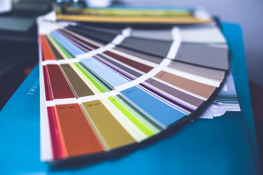
Color 101
Any discussion of color must include the effects of both warm and cool colors as well as the so-called “neutrals” (colors that do not appear on the color wheel). The class of color also contributes to the overall mood or emotional response to the space, as well as the perceived size of the space, regardless of its dimensions.
All colors can lean toward warm or cool, depending on the addition of another color. In that way, red can be even warmer if it leans toward the orange-yellow area of the color wheel. Blue, although seen almost exclusively as “cool” can lean toward warm with the addition of a warming color (as in plum or the deepest eggplant, both achieved by the addition of red).
As a rule, warm colors contain pure red or yellow. Some contain additions of red or yellow in various shades to create orange or brown colors from pastel to vibrant to deeply saturated.
Cool colors occupy the opposite side of the color wheel and most contain blue or green in some form, while primary blue is most definitely a pure cool color. Adding blue to almost any other shade or color can transform that first color into a cool-leaning color, while adding a warm color like yellow to green can make that cool green into a warmer version of green.
Black, white, gray and brown and their various shades are all considered neutral colors. But even neutral colors can lean toward warm or cool, depending on the undertones achieved by adding either a warm or cool hue. Although brown is definitely a neutral that leans toward the warm end of the color spectrum, adding cool pink can turn that brown into “rose-brown” which definitely comes across as cool-leaning.
Add a tiny amount of yellow to white and you have a warm white. Add a tiny amount of blue to white and you have a cool white. This is most evident in strings of holiday lights. The warm ones glow yellowish in the dark and the cool ones glow bluish in the dark. Adding a tiny amount of the lightest brown (usually called tan) will turn pure white into almond, another warm version of white.
Black is sometimes seen as the absence of color, but that's just because it absorbs all the light and does not reflect any back. But add white to black and you get gray. If you then add blue to the gray, it becomes a cool gray. Add very light brown or yellow to gray and that gray will come across as warm.
Emotional Effects of Color
Colors evoke an emotional response in almost everyone, although everyone has a response to color that is immensely personal. Color also sets the mood of the space, be it relaxing or stimulating. Can you mix both relaxing and stimulating colors in the same space? Yes, but this may be best left to a professional.
Red is used to decorate restaurants because it is known to increase both your appetite, strong emotions and physical desires. It is the color of power and strength, energy and love. Red stimulates and excites you but also exudes warmth. Use red judiciously because too much red can be overstimulating in your home.
Pink is a nurturing color, evoking compassion, love and happiness. It is also a highly feminine color and when not used with restraint can evoke immaturity and weakness. To decorate a room in pink that does not look sappy and too girly-girly, use simple, clean lines and sophisticated fabrics such as velvet, toile and/or raw silk. A combination of these fabrics, carefully chosen, will create a variety of textures that keep the eye moving beyond the “pinkness” of it all.
Orange represents joy, enthusiasm, sunshine and the tropics. Used to stimulate creativity, encouragement and success, orange is widely used in spaces housing creative minds, such as advertising, marketing, fine arts and the craft trades. Because of its stimulating effects, orange is ideal for an exercise room or a kitchen. If red seems like too aggressive of a color for you, orange is a viable replacement because it too can stimulate you and make you feel more energetic.
Yellow is a welcoming color and is an excellent choice for an entryway. Bright yellow makes you feel optimistic and light yellow makes you feel joyful. Because it is the color of sunshine, it also makes you feel happy. Try to use yellow sparingly, because too much of it in a room can feel overstimulating. Also, choose a bright yellow, whether you use a light or deep hue because dingy yellows can evoke sickness or decay.
Blue is the most-used color in user interfaces of computer programs and also hugely popular in home interior decoration. It has a calming effect and is known to slow down your metabolism and even lower your blood pressure. Blue works well paired with yellow, white or in concert with multiple shades of blue.
Green is all around us in nature and has the same calming effect when used in interior decorating. It symbolizes hope and security and feels fresh and safe. Green can be used as the basis for decorating an entire house. It will pair well with most other colors so each room has its own color identity with green as the common denominator, pulling everything all together.
Purple is one of the most sophisticated colors used in interior decorating. It creates formality and richness while adding a sense of luxury. The darkest purples are the most dramatic and sophisticated, while lighter shades such as lilac or lavender are calming and restful.
Black is the ultimate in sophistication in interior design. It evokes luxury, elegance and prestige. Although most commonly used as an accent color, it can be used as the main color by carefully balancing it with bright accent colors. It is used most successfully in this way by a professional interior designer.
White evokes innocence, goodness, purity and cleanliness, not to mention faithfulness. It is also calming and relaxing and it is no accident that hospitals use this color extensively in their interior designs. It can also evoke feelings of emptiness if the space is bereft of any accent colors. White is a pristine color, which can inhibit relaxation if one is worried about soiling or ruining the perfectness of an all-white room.
Brown gives us a feeling of security and stability. A color everywhere in nature, brown is not on the color wheel and is considered a neutral in terms of interior design. A good way to add the calming effect brown brings as a color found in nature is to use it by adding hardwood moulding in a shade of brown that is complementary to your overall color scheme.
Gray is our last neutral color and is elegant in a subtle way but not overly conservative. A yellow-gray can be depressing in a brown room, but gray combined with yellow accents is ultra-sophisticated. Combine gray with white and you create a clean, refreshing feeling.
Using Color to Make your Rooms Cozy with Natural Daylight
North-facing rooms naturally receive bluish, cool light all day long. It is best to use bold colors in these rooms. If the room is small and you want to make it look larger, a cool color will make the walls appear to recede giving the impression that it is larger than it actually is. However, because the room faces north, make that cool color bold and bright for maximum effect in the softness of the north-facing light.
Another trick is to paint the ceiling a shade or two lighter than the walls to add a feeling of spaciousness. A good trick is to add one to two cups of your wall color to a gallon of white paint for the ceiling color. It will be lighter than the walls and will not clash.
To make a north-facing room appear smaller, paint the walls a bold, dark shade. This has the effect of making the walls appear closer, which makes the room feel smaller. Another way to make a large room feel smaller and cozier is to paint the ceiling a darker shade than the walls. Choose a color on the same paint sample strip as your wall color that is at least two shades lighter than the one you chose for the walls.
South-facing rooms are bathed in sunlight virtually all day long. This has the effect of bringing out the best in virtually all colors, whether they are warm or cool. The darker shades will look richer and brighter but not overpowering. Lighter shades of colors will glow as they bask in the sunshine of a southern exposure.
Use the same tricks to fool the eye in a south-facing room that you would use in a north-facing room relative to a too-small or a too-large space. The only difference is that you can use virtually and shade of warm or cool colors and the southern exposure will make them look fantastic.
West-facing rooms have little light during the morning and early afternoon hours which tends to make colors look dull. However, once the sun moves to the western sky, the light changes, becoming warm and welcoming. If you use a west-facing room only in the evening, any color will work for you. If you use it during other parts of the day, choose lighter colors with a glossy finish. The gloss reflects light and appears to minimize shadows.
A room that faces east will experience warm, yellow light in the morning and bluish light as the day wears on. Rooms with eastern exposure look stellar with warm colors such as red, yellow or orange.
To make a room that faces sunrise or sunset look smaller or larger, use the same tricks for north-facing or south-facing rooms. Warm colors will make a too-large room smaller. Lighter colors will make a too-small room look larger. Just remember to use a glossy finish in rooms with western exposure to avoid shadows if you use the room all day long.