Newsletters are powerful tools that can really garner a big following for your company. But while a newsletter might seem like a fairly straightforward concept on the surface, there is a lot more to it than just sending emails to people willy-nilly. You might be looking for newsletter design inspiration, and we are going to provide some email newsletter examples for you to look at.
But before that, let’s talk about the general aspects that every newsletter needs to keep in mind.
What is the Purpose of a Newsletter?
The goal of a newsletter is quite simple: keep people invested in what you have to offer. If you are a company, for instance, a newsletter can give people a sneak peek of interesting stories you are posting that week, enticing them to pay your website a visit. If you are a retailer, a newsletter can show off your newest products.
Either way, the point is to keep the people you already have following you invested in your company. This means you need to know your target audience well enough to determine what they want to see. Of course, this also means there are no actual concrete rules about what a newsletter needs to look like or what kind of content it has. However, there are some elements that all newsletters should follow.
Important Newsletter Elements
Even though the actual content of your email newsletter will vary depending on your company and your goals, every newsletter should follow these basic principles of design:
- The copy must be interesting: newsletters are mostly about words, not pictures. If the text is not interesting to read in some fashion, it won’t keep anyone’s attention, which defeats the purpose of the newsletter.
- The content should be limited: newsletters are supposed to be small excerpts of your company’s offerings at any given time. They don’t need to be crammed full of content. They should have a select few topics, with links to more content for the reader to pursue if they wish.
- Maintain consistent formatting: while you can add new things every once in a while, people like consistency with newsletters: they want to know where they can find what information every single week.
- Break up the content: use headers and subheadings to break up the content fairly frequently. Big walls of text are difficult for readers to stay invested in, and they will probably lose interest.
These are elements that most newsletters should have, but there are also certain things that you don’t want newsletters to have. Namely, “stop” words.
Avoiding “Stop” Words in Newsletters
What are stop words? Well, It's actually pretty complicated, but here’s the simple version: email services try to determine which emails are legitimate and which are spam. Part of this process includes checking which words come up in the email. If the saturation of these words is too high, the email service may send your email to the spam folder before a recipient ever sees it. So naturally, you want to avoid that with your newsletter.
Here are some of these words you need to try and omit from your newsletter:
- Guarantee
- 100% Satisfaction
- Click
- Alert
- Order
- Exclusive
- Friend
- Services
- Bargain
- Congratulations!
- Investment
- Free
- Opportunity
Notice a trend here? These are all words that show up in spam emails very often. So if you use them too much in your newsletter, it is likely to get marked as spam.
So, now that you know what to include and what not to include, let’s look at some actual email template design inspiration.
Best Email Newsletter Examples
There are many ways to design a newsletter, and we can’t show them all. But we can show some very well-designed options, starting with the template below:
Oscar Monthly

This newsletter is simple but effective: it’s quite minimalistic and doesn’t have that many elements, but that makes the charming images stand out even more. The different sections are segmented well, easily dividing topics and letting readers know where each one begins. Brief excerpts and clear headings give you enough information to know what each topic is about while also providing a clear way to read more on the topic if you so desire.
Also note the consistent color palette used throughout this template: a good color scheme that makes your newsletter pleasing to the eye is critical.
Next Draft
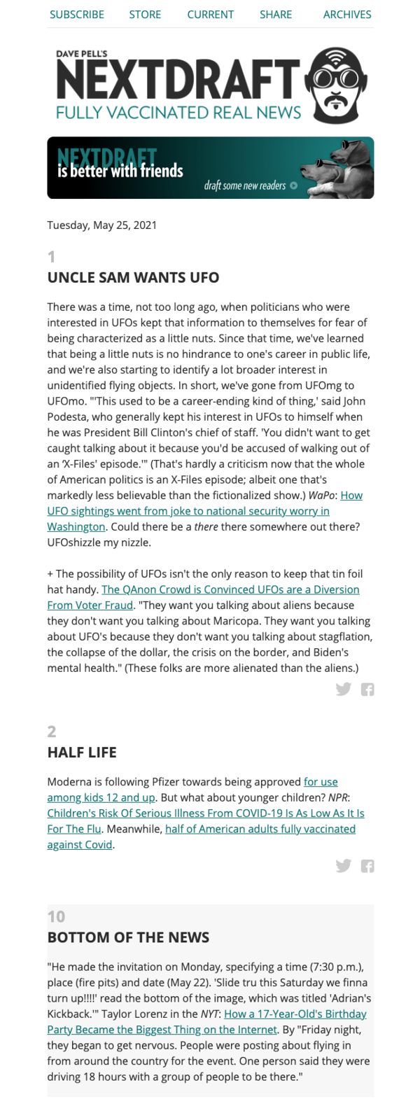
This time, let’s focus on the text itself. The heading is unique and garners interest, prompting readers to continue. The copy is interesting and witty without diving into the campy, immature, or ridiculous. Perhaps, most importantly, the newsletter provides links to multiple sources and perspectives on the content that is being discussed. This is a great way to write a newsletter that focuses on actual news.
Blinkist

Minimalist design can still be creative and colorful. This newsletter uses striking colors to catch the eye and engages the reader by asking them questions that help tie them into both the greater community and the brand. Furthermore, the actual content is perfectly bite-sized: readers will be more likely to open and read the newsletter if they know they can skim everything in a minute or so. After all, less time means no skin off their teeth if they’re uninterested.
Summary
There is no universal best template for an email newsletter. It depends on what your purpose is: a restaurant newsletter might need to show off more pictures, while a newsletter telling stories will focus more on text. However, all newsletters need to focus on grabbing the reader’s attention with catchy headlines, interesting snippets, and well-segmented sections that allow the reader to identify different areas of content.
Aside from those mainstays, and avoiding spam trigger words that might get your newsletter erroneously flagged, you have a lot of leeway with your design. Just make sure you don’t crowd the page with blocks of text, or overwhelm the reader with too many vibrant, conflicting colors.