A room can look beautiful and still be annoying to live in.
The sofa is stylish. The rug is expensive. The lighting is warm and flattering. Yet getting from the hallway to the kitchen means squeezing past an armchair, dodging a side table, and trying not to kick the ottoman for the third time that week.
That’s not bad luck. It’s bad placement.
Furniture decides how people move through a home. It affects where they stop, how they gather, and whether a room feels calm or crowded. Sometimes, moving one large piece by a few feet fixes more than a costly decorating update ever could.
Watch How People Move Through the Room
Start with the paths people already use.
Where do they enter? Where do they go next? Does the living room lead to the kitchen, patio, stairs, or hallway? Which route gets the most traffic during a normal day?
Those paths should stay clear.
Main walkways usually need about 30 to 36 inches of space. That gives most people enough room to move comfortably without turning sideways or brushing against furniture. Smaller gaps can work between less frequently used pieces, but busy routes need breathing room.
Here’s the easiest test. Walk through the room carrying a laundry basket.
Suddenly, every awkward corner becomes obvious.
A layout may look fine when the room is empty and quiet. Real life tells the truth. Grocery bags, children, pets, visitors, and the occasional cup of coffee all expose bad planning pretty quickly.
Decide What the Room Needs to Do
A room can serve more than one purpose, but one function should lead.
A living room might be used for watching television, reading, talking, working, and falling asleep halfway through a movie. Fair enough. Still, the furniture needs a clear direction.
For a conversation-focused room, seating should face inward. Chairs lined up against separate walls make people feel like they’re waiting for an appointment. In a television room, everyone should have a comfortable view without twisting their neck. In an open-plan home, the layout should separate activities without building invisible barricades.
Pick the main purpose first.
Everything else becomes easier after that.
Stop Pushing Every Piece Against a Wall
Furniture doesn’t need to cling to the perimeter of a room.
Many homeowners push sofas, chairs, and cabinets against the walls because they believe it makes the space look bigger. Sometimes it works. Often, it creates a large, empty patch in the middle and leaves people sitting too far apart.
The room feels less connected.
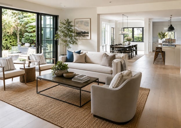
Pulling a sofa forward by six or eight inches can make the whole arrangement feel more considered. In a larger space, floating furniture creates useful zones. A sofa can divide a living area from a dining area, while a narrow console behind it provides storage and a place for lighting.
This method works particularly well when choosing interior design furniture for an open-concept home, where each item needs to define its own zone without blocking the wider route through the property.
Walls are helpful. They just don’t need to babysit every chair.
Place the Largest Item First
Every room has an anchor.
In a bedroom, it’s usually the bed. In a dining room, it’s the table. In a living room, it may be a sofa, sectional, fireplace, or entertainment unit.
Start there.
Placing smaller pieces first tends to create unnecessary reshuffling later. The largest item controls the visual weight of the room, so it should support the best focal point and the clearest path through the space.
A bed often works best on the longest uninterrupted wall. A dining table needs enough room for chairs to pull out without blocking a doorway. A sofa should face something worth looking at, whether that’s a fireplace, television, large window, or garden view.
Once the anchor feels right, the rest usually falls into place.
Not perfectly. But close enough to stop moving the same chair around for an hour.
Keep Entrances and Windows Open
A room feels smaller when furniture crowds its openings.
Doors should open fully. Windows should let in light. The first few steps into a room should feel easy, not like an obstacle course.
Placing a tall cabinet in front of a window may solve a storage problem, but it can make the room darker and heavier. Blocking a doorway with the back of a sofa creates the same issue. People enter the room and immediately feel closed in.
Natural light deserves room.
So do people.
This matters even more when a home is being prepared for sale. Buyers may not say, “The circulation pattern feels restricted.” They’ll simply think the room feels cramped. That impression can stick.
Choose Furniture That Fits the Space
Placement can’t rescue a piece that’s far too large.
An oversized sectional might look perfect in a showroom, then take over half the living room at home. A bulky dining table can leave no space for chairs to move. Too many small pieces cause a different problem, making the room feel scattered and busy.
Scale matters as much as style.
Smaller rooms often work better with slim arms, raised legs, glass surfaces, and open bases. These features reveal more floor and create a lighter look. Larger rooms can handle deeper sofas, heavier tables, and wider gaps between pieces.
Mixing visual weight also helps. A substantial sofa can pair well with lighter accent chairs. A large dining table may feel less imposing with simple, narrow-profile seating.
Sometimes the right move isn’t rearranging.
It’s removing something.
Make Conversation Easy
Furniture should help people talk without making them shout.
Sofas and chairs need to sit close enough for comfortable conversation, but not so close that the room feels packed. Coffee tables generally work best about 14 to 18 inches from the sofa. That’s close enough to reach, yet far enough to leave legroom.
Side tables should sit near the height of the chair or sofa arm. Lamps should be easy to switch on. Drinks should have somewhere sensible to go.
These details sound small until they’re wrong.
A table that’s too far away becomes useless. A chair with no nearby surface soon collects a mug on the floor. Then someone kicks it. Naturally.
Let Empty Space Stay Empty
Not every corner needs filling.
A blank wall doesn’t always need a console. An empty corner doesn’t automatically require a plant, chair, basket, or decorative ladder holding blankets no one touches.
Empty space helps a room breathe.
It gives important pieces more impact and makes movement easier. In smaller homes, this becomes even more valuable. Every extra item narrows the room visually, even when it doesn’t fully block the path.
A little restraint often looks more expensive than clutter.
That’s a hill worth standing on.
Test the Layout During a Normal Day
A floor plan can look sensible on paper and fail in practice.
Sit in every chair. Open every drawer. Pull out the dining chairs. Walk from the entrance to the kitchen. Check whether a cabinet door hits the sofa or whether someone has to move a stool every time they cross the room.
Try the layout when people are actually using the space.
That’s when the flaws appear.
Good furniture placement doesn’t demand attention. It simply makes the home easier to live in. People move without thinking. Rooms feel connected. Nothing seems awkward or forced.
That’s the real test.
Not whether the room photographs well, but whether it works when life gets messy.