


Having a mobile-friendly website in the digital era is essential as mobile devices are becoming a necessary component of our everyday lives. Businesses that redesigned their websites in 2024 should prioritize mobile-first since most internet consumers visit websites through smartphones and tablets.
The Importance of Mobile-First Design in 2024
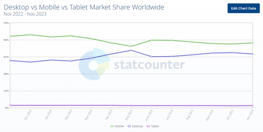
To begin with, the following lists the most recent global mobile and desktop share figures. As we can see, 61% of mobile usage and 38% of desktop usage occurred in the 2022-2023. This trend is also expected to increase.
In addition to the overwhelming data, the following are some more justifications for thinking about designing your website with mobile devices in mind:
• enhanced usability;
• increased availability;
• improved functionality of the website;
• enhanced scalability;
• improved Google indexing.
It's also important to note that Google indexes and ranks information primarily from mobile versions of websites. Since the indexing is mobile-first, we advise starting your project on a mobile device. If you use website redesign services, then they will say that your website on the phone is a priority.
Implementing Mobile-First Design Principles
Planning and paying close attention to detail are essential to making sure your website is not just responsive but also optimized for mobile devices. These are the essential actions to take:
Give Content and Features Priority
Determine which features and content are essential for mobile users first. What details are most important to them? What are the likely courses of action for them? Give these components top priority and ensure that they are simple to find on tiny displays.
Design that Responds
Adopt responsive design strategies to make sure your website adjusts to different screen sizes without breaking a sweat. For the best viewing experience across devices, use the automatic adjustment of flexible grids, pictures, and layouts.
Simplified Wayfinding
Make it easier for mobile visitors to navigate your website. Condense navigation choices by utilizing mobile-friendly menu designs such as the hamburger menu. Aim for a simple, easy-to-use menu layout that effectively directs consumers.
Mobile-Friendly Photos and Videos
Save load times on mobile devices by optimizing photos and media files without sacrificing quality. To improve efficiency and make sure that content loads as users scroll, employ lazy loading.
Touch-Friendly Components
Create interactive components and buttons that are touch-friendly. Make sure the buttons are positioned and sized correctly to avoid annoyance or unintentional clicks. Incorporate touch-friendly interfaces and swiping movements.
Quick Loading Speeds
Users of mobile devices need speed. To improve loading speeds, reduce the number of HTTP requests, compress data, and make use of browser cache. Try to load content almost instantly, especially on 4G and 5G networks.
Mobile Search Engine Optimization (SEO)
Put recommended practices for mobile SEO into practice. Pay attention to structured data markup, mobile sitemaps, and the speed of mobile-friendly pages. Keep an eye on your mobile search ranks and change as needed.

Best Practices for Mobile-First Website Development
Here are some excellent practices for developing mobile-first websites to aid with your navigation.
Implementing Progressive Web App (PWA) Features for Enhanced User Experience
Use mobile-specific frameworks and technologies to improve performance and expedite the process of creating a mobile-first website. Among the choices are:
1. Bootstrap and Foundation. The pre-built components and grids offered by these responsive front-end frameworks make the mobile-first design simpler.
2. AMP (Accelerated Mobile Pages). Google-backed AMP is an initiative that gives priority to mobile-friendly, quickly-loading web pages. You may enhance the mobile user experience and performance of your website by implementing AMP.
3. Flutter and React Native. With the help of these frameworks, you can create mobile apps that function on iOS and Android and have a single codebase, offering a unified user experience.
Integrating Mobile Analytics and Performance Tracking Tools
Incorporate these tools to make sure your mobile-first website is fulfilling its objectives and providing a top-notch user experience. To get the most out of these tools, follow these tips:
1. Mobile Analytics for Google. Track conversions, learn about user behavior, and pinpoint areas that need development for mobile users using Google Analytics.
2. Mobile-Specific Heatmaps. Use heatmaps to see how people navigate your mobile website. Determine interest regions, typical gestures, and possible trouble spots.
3. Tracking Performance. Keep an eye on how well your website functions on mobile devices. PageSpeed Insights is one tool that can offer optimization advice.
4. A/B Evaluation. To compare various calls to action, content layouts, and design aspects, run A/B tests on your mobile website. Make defensible judgments by utilizing data-driven insights.
These best practices will help you build a mobile-first website that meets mobile users' needs and provides a smooth, engaging, and high-performance experience across all devices.
Conclusion
Users are likely to engage with your business through mobile applications and platforms. Therefore, it is vital to make sure they are in top condition, given that the world is quickly becoming a faster-paced, mobile-heavy society.
