Small bathrooms get judged fast.
Nobody walks in, pauses, and starts calculating square footage. They react to what the room feels like. Is it calm or cramped? Clean or cluttered? Bright or a little boxed in? That first read matters more than most homeowners expect, especially when a home is being shown to buyers who are already scanning for signs of compromise.
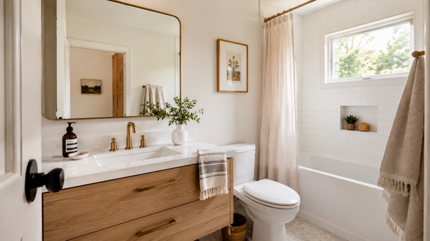
That instinct is not trivial. The National Association of Realtors reported in its 2025 Profile of Home Staging that 83% of buyers’ agents said staging made it easier for a buyer to visualize a property as a future home, and 26% said staging affected most buyers’ view of the home. Bathrooms are not the first room most people name when they talk about staging, but they are one of the quickest rooms to trigger a judgment. In a tight layout, a white bathroom vanity from BathGems can make sense when the goal is to reduce visual weight and keep the room feeling brighter from the first glance.
That is where homeowners often miss the point. Value is not just about what you added. It is about what the room communicates in the first few seconds.
Space is judged in seconds, not square feet
Most people assume a bathroom feels small because it is small. That is only partly true.
What actually drives the reaction is visual weight. A room can be modest in size and still feel composed if the eye moves through it easily. The reverse is just as common. A bathroom with decent dimensions can feel tighter than it is when bulky cabinetry, hard contrast, and broken sightlines stop the eye at every turn.
In my experience, this is where homeowners get pulled off course by inspiration images. They see a dramatic vanity, a dark finish, or a heavily framed mirror in a large designer bathroom and assume the same move will carry over to a narrower footprint. It rarely does. Scale is doing the heavy lifting in those photos, not the finish itself.
The room is also judged as a whole, not as a collection of parts. People do not mentally award points for a nice faucet if the vanity overwhelms the floor area. They do not care that the tile was expensive if the room still feels dim. They care about whether the room looks manageable, intentional, and easy to live with. That is also part of how an interior designer thinks about function and flow, even in spaces that are far from custom or high end.
That distinction matters for resale, but it matters for everyday use too. A bathroom that feels crowded asks more of you every morning. It makes storage feel chaotic faster. It makes cleaning look unfinished faster. It even makes decent updates feel less impressive than they are. The same logic shows up in how sellers prepare a home overall, especially when staging made it easier for a buyer to visualize a property.
The choices that quietly make a bathroom feel larger
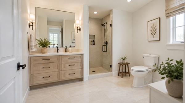
Image: ChatGPT
Start with the view from the doorway.
That is the angle buyers see first. It is also the angle homeowners stop noticing after a while, which is why this part gets neglected. If the first thing the eye lands on is a thick cabinet body, a dark block of material, or a vanity that stretches wall to wall with no breathing room, the room tends to read as smaller right away.
Floor visibility matters more than people think. When more of the floor remains visible, the room usually feels more open. That does not mean every bathroom needs a floating vanity. It does mean the base of the room should not feel visually overloaded for no good reason. Even a freestanding piece can work well if the proportions are disciplined and the clearance around it still feels intentional. This is the same visual logic behind many of the moves that help make your bathroom look larger.
Finish plays a role too, but it is not magic. A lighter vanity can help a bathroom feel cleaner and less visually dense, especially when the room already struggles with natural light. White tends to read with less visual force than a darker, bulkier alternative, which is exactly why it works so often in tighter footprints.
Mirror size is another underused lever. A well-scaled mirror extends light, softens boundaries, and helps the room feel more complete. The same is true of lighting. The National Kitchen and Bath Association's planning guidance puts real emphasis on illumination and fixture placement because clear, functional light changes how a bathroom works and how it is perceived. A room with uneven light tends to look older and smaller than it really is.
Then there is continuity. Flooring that runs cleanly, fewer abrupt material breaks, and a restrained color story all help. The point is not to make the bathroom bland. The point is to reduce the visual friction that makes a small room feel busier than it needs to.
Where homeowners get it wrong
The most common mistake is oversizing the vanity.
People worry about losing storage, so they buy the biggest unit the wall can technically hold. That solves one problem on paper and creates three more in practice. The room feels tighter. The walking path gets pinched. The whole bathroom starts working harder just to justify the cabinet.
The second mistake is chasing contrast for its own sake. In a larger bathroom, contrast can give the room structure. In a smaller one, it can break the room into pieces. Strong black-and-white pairings, deep cabinet colors, and busy material shifts all have their place. They just need more visual room than many compact bathrooms can offer.
Another mistake is treating style and function like separate decisions. They are not. A vanity is not just a storage box. It sets the tone for how grounded or crowded the room feels. A mirror is not just decorative. It changes how the room distributes light. Even drawer style matters, because daily use has a way of exposing bad planning faster than photos do.
I have every reason to think that homeowners also underestimate how fast a bathroom can look dated when the room tries too hard. Trend-heavy tile, ornate hardware, and furniture-style vanities often draw attention to themselves first and the room second. In a smaller bath, that is usually the wrong order.
A simple framework for smarter bathroom decisions
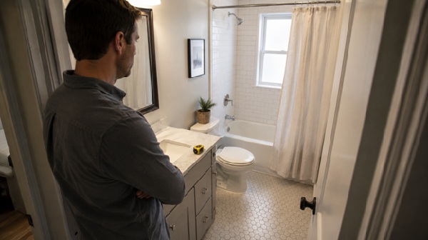
Image: ChatGPT
When a bathroom is small, every choice needs a job.
Here is a better way to judge the room before spending money.
First, stand at the doorway and ask one blunt question: what feels heavy first? If your eye lands on a dense cabinet block, a dark mass, or an awkward angle, that is probably the room's biggest visual problem.
Next, check floor visibility. Can your eye travel through the room without getting interrupted every few inches? More visible floor area often makes the room feel less boxed in, even before any major renovation happens.
Then measure for clearance, not just fixture width. This is where planning gets real. The NKBA's bath planning guidelines exist for a reason. A fixture can fit and still function poorly if the clearances are stingy or the placement forces awkward movement.
After that, judge storage by what it hides, not by how large it looks. Bigger is not always better. Well-organized drawers and sensible compartments often outperform bulky cabinetry that eats up the room.
Last, pick one visual priority. Maybe the bathroom needs brightness. Maybe it needs warmth. Maybe it needs cleaner lines. Trying to force all three at once is where smaller rooms start getting muddy.
This sounds simple. It is. Better bathroom decisions usually come from editing, not piling on.
Trade-offs that are worth admitting
A lighter bathroom is not always a warmer bathroom.
That is the first trade-off. White and pale finishes can open up a room visually, but they can also feel flat if the lighting is harsh or the surrounding materials are too cold. The fix is not to abandon the lighter palette. It is to add warmth in controlled ways, through wood tone, metal finish, paint choice, or texture.
There is a storage trade-off too. Homeowners are right to want more of it. The Houzz 2025 U.S. Bathroom Trends Study, based on a survey of 1,737 renovating U.S. homeowners, shows just how function-driven bathroom projects still are. But function is not the same as visual bulk. If a vanity makes the room feel squeezed every time someone walks in, the storage win comes with a real cost. In other words, resale value is rarely just about one feature.
Floating vanities are a good example of nuance. They often help smaller bathrooms feel lighter. They also expose more floor, which usually helps the room read better. But they are not automatically the right answer. If the household truly needs deep storage and the rest of the room offers none, a floating design can create a new daily frustration while solving an aesthetic one.
This only works if the room is planned as a whole. That is the real friction point. A bathroom feels more valuable when the visual choices and the practical choices agree with each other.
What buyers remember after they leave
Buyers rarely walk out talking about cabinet construction.
They talk about whether the bathroom felt tight. Whether it felt clean. Whether it seemed updated without trying too hard. Whether the room felt like one more thing they would need to fix. That is the memory that sticks.
A small bathroom does not have to feel luxurious to add value. It has to feel resolved. That usually comes from better proportion, clearer light, less visual noise, and a layout that respects the limits of the space instead of fighting them.
That is also why the smartest updates are often the least theatrical. They do not beg for attention. They make the room easier to understand at a glance. In a house full of quick impressions, that quiet competence goes further than most homeowners realize.